Market Guides - Great.gov.uk
Organisation
Department for Business & Trade
Role
Interaction Designer
Project Overview
My team and I redesigned the market guide page for great.gov.uk for all 108 markets covered on the platform. This led to a 22% increase in average time spent by users.
The problem/The brief
Our problem statement: "As an owner of a UK SME with little or no export experience, who feels confident in their choice of a target export market, I need trustworthy and actionable information and advice to plan and complete an export. But I can't find what I need in one place".
Previous research completed on market guides unearthed the below problems reported by users:
The information on the current page was too high level
Users considered the information on gov.uk duplicate but more thorough
There was seemingly endless scrolling
Important information was hidden and/or located towards the bottom of the page
The 'next steps' calls to action did not support onwards journey that users found useful
My role
To enhance the Market Guide experience for UK SMEs, I collaborated with Trade Advisors, gaining user insights. I then co-led a cross-functional workshop, guiding design solutions from initial sketches to high-fidelity prototypes. I partnered with the user researcher on testing, attending sessions and synthesizing findings to inform design iterations. After a second round of testing and design refinement, I finalised responsive designs, ensuring a smooth handoff to developers for a phased rollout.
Process
Research
I began my involvement in the project by participating in meetings with Trade Advisors who work directly with our target audience, UK SMEs. During these sessions, I asked targeted questions to gain valuable insights from their perspectives.

Workshops/Ideation
Later in the project, I co-hosted a workshop with a team consisting of a content designer, two developers, two marketing executives, a project manager, a user researcher and another interaction designer. We split the team into two and I guided my team's design solutions and visualised them with initial sketches, to present back to the wider team.
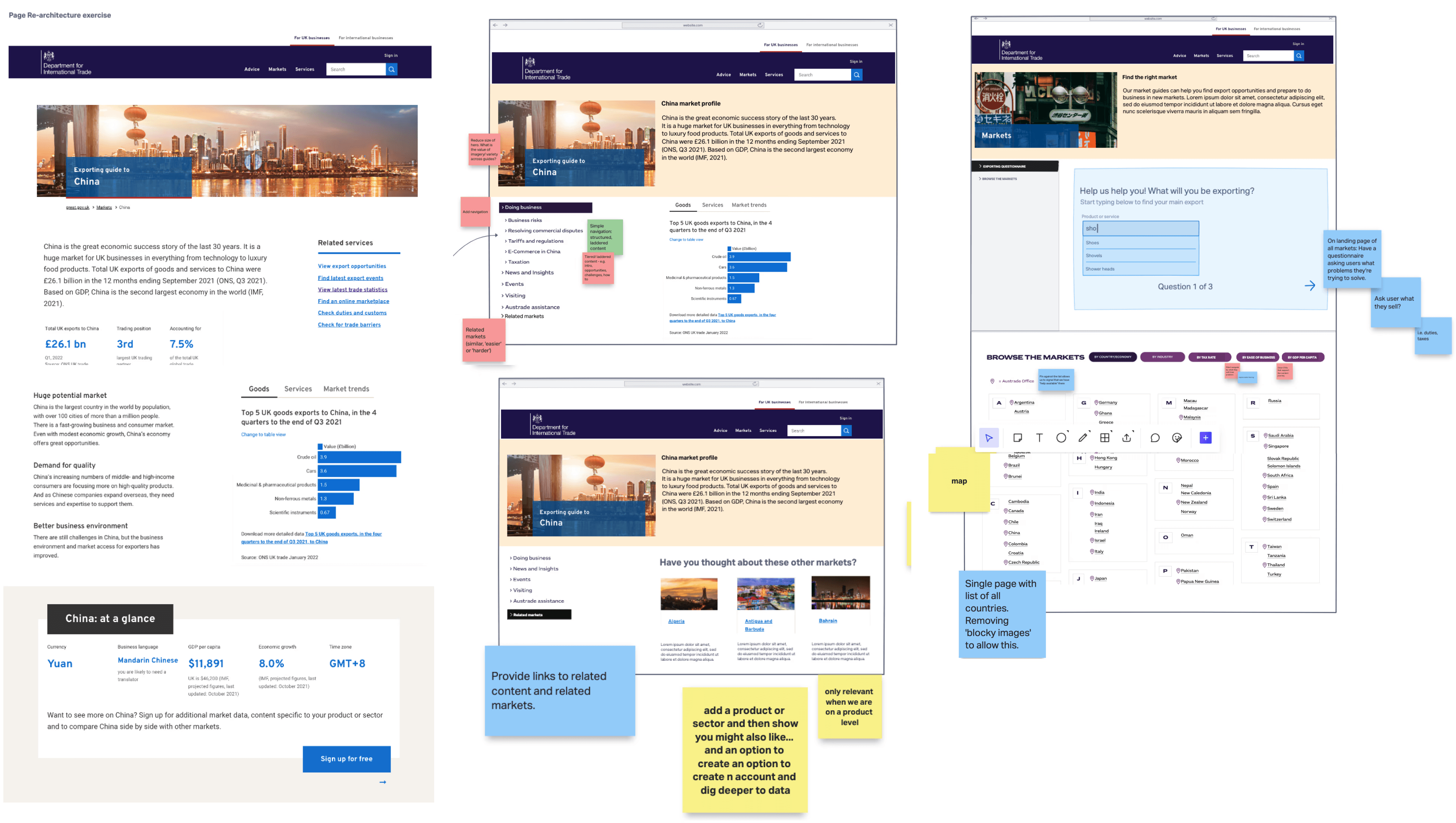
Usability testing/Iteration
After developing these ideas into high-fidelity designs, I collaborated with the user researcher, offering input on the discussion guide for user testing. I attended both the research and synthesis sessions, grouping similar findings into themes to identify key insights. These insights were essential for iterating the designs ahead of the second round of user testing.

Responsive design
After round 2 and further refinement of the designs, I developed the final designs for varying screen resolutions. Following a seamless handover to the front end development team, the designs were green-lit to be rolled out in two tiers.
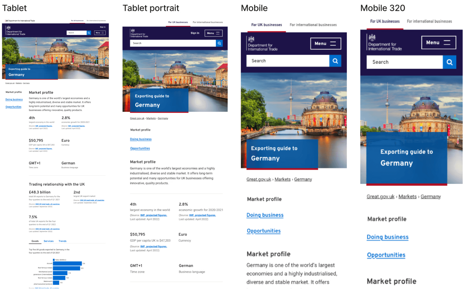
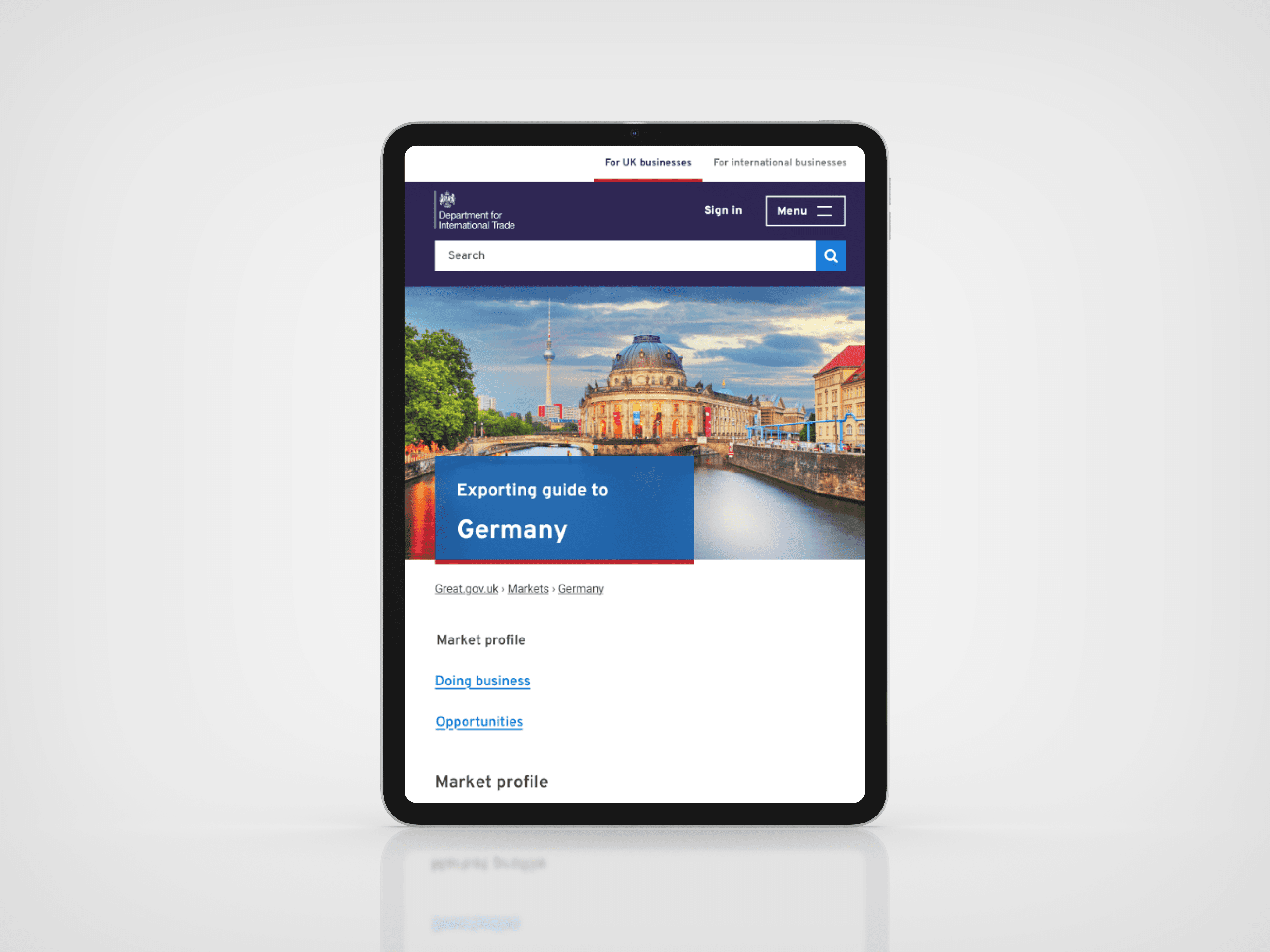
Before vs After
Before

After

User Interface
I used the Atlas design system, the foundation of great.gov.uk, to design the new market guides. Built on the GOV.UK Design System, Atlas ensures its components and patterns meet WCAG accessibility guidelines, including sufficient colour contrast, accessible hover states, and proper sizing.

Impact
In the month following the launch of Tier 1 of the new design, the average time users spent on Market Guides increased by 22%. This highlighted that the improved guides provided more engaging and useful information for potential exporters, encouraging them to spend more time exploring and interacting with the content.
This success was driven by addressing key pain points identified through research:
Pain Point: Information was too high-level.
Response: Enhanced content on export opportunities, duties, customs, and more.Pain Point: Overlap with GOV.UK content, perceived as duplicate but more detailed.
Response: Added clear signposting and references to GOV.UK for further details.Pain Point: Endless scrolling and hidden important information.
Response: Improved navigation with tabs, clearer hierarchy, and shorter sections. Key areas like Exporting, Events, and Marketplaces were repositioned for easier access.Pain Point: 'Next steps' calls to action lacked clarity and did not encourage onward journeys.
Response: Enhanced the 'next steps' with more context, better offerings, and clearer benefits for users.
These changes significantly improved user engagement and satisfaction.